Collector Insights
Our collector insights are for all of you that have been in this gaming collective for a long time. WE are many that live the past of our gaming experiences on the good old machines. Nostalgia is a great feeling in the conjunction with memories. There are so many stories to tell from the past, mostly shared with friends. Shared in your homes, in the arcades and as in one of my major experiences when playing Kung-Fu Master in the entrance of a Pizza joint.
How we collect also differs a lot, some search for the games they played, some are holy to the machine they owned. Some extend it to the era and also collect the competition and finally we have thos who collects everything spelled “games”.
Anyway, independently on who of the personas you feel familiar with we all share the same joy.
We will from time to time give you some collector insights and add some examples on the differences that exists out there – there might be small details differing, a new version or even a change of name due to copyright issues. See this as a collector guide in how to look for deviances.
Today we will focus on a minour differences that you can find on the Bug-Byte label. For the example today we have picked Sea Lord from Bug-Byte for the BBC Micro.
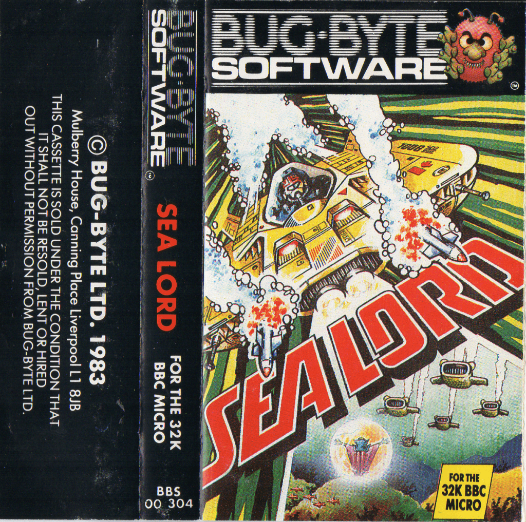
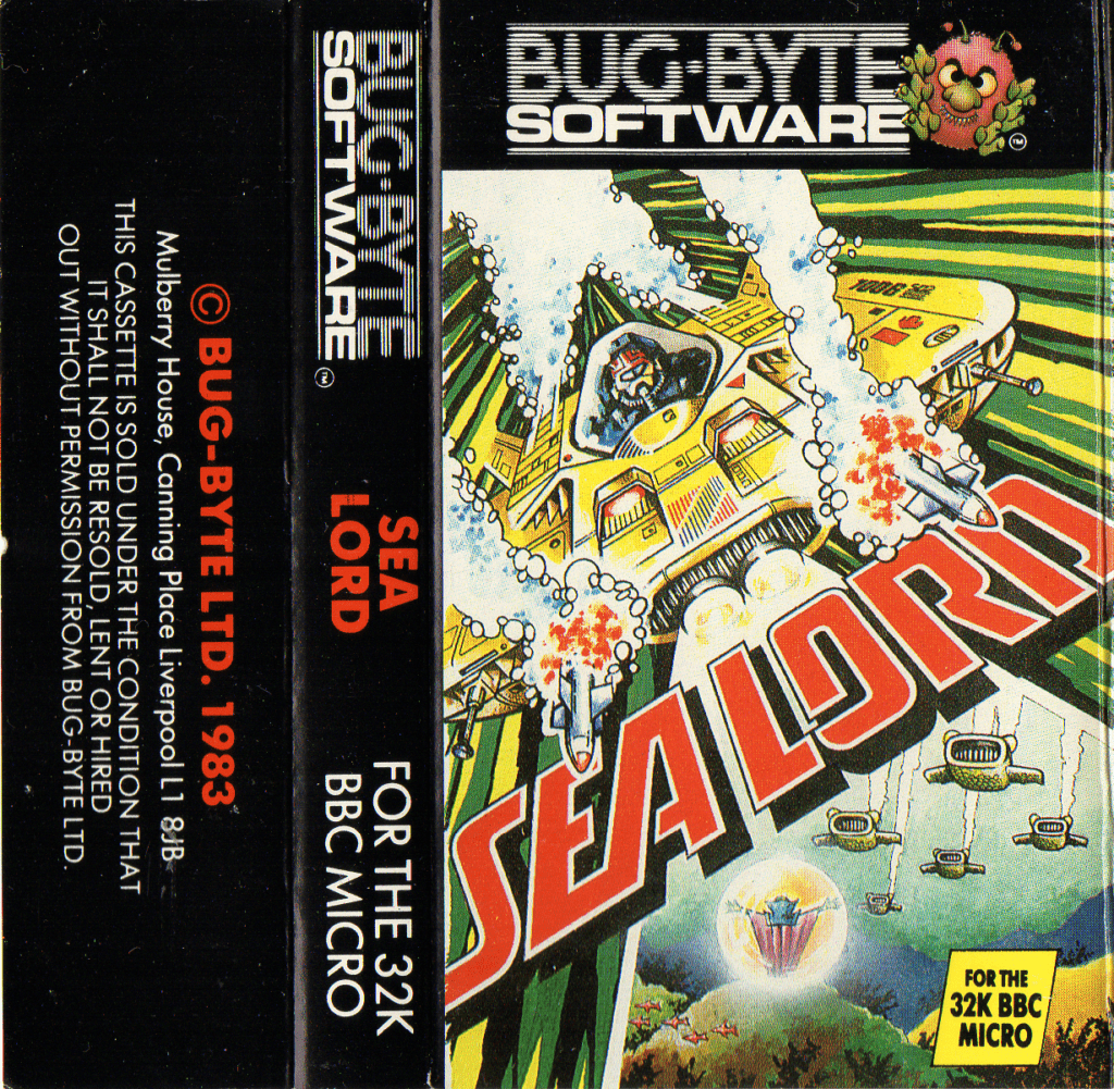
At first glimpse you don’t react that much, and especially when seeing them in their right surrounding in their plastic case. It is common to see that the actual casette inside can differ in colour, being labeled to not being labeled.
Above we can see som definite differences that you find in Bug-Byte titles – let us go through them.
Fonts and Text


For starters, the most common deviance is that one holds the serial number and a smaller font size on the machine name. There is also the printed name of the game – in this game it is aligned differently. But this does not have to be the case every time.
Colours


There are two parts of different colouring. Firstly we have the font colours – in this case we have white in one and red in the other on the printed company name (Bug-Byte LTD. 1983). This is also a place to detect different revisions of the game.
Harder to detect is the colour selections on the cover art itself. What os a different version? We have found four different reasons for colour deviances on the cover.
- Different revisions of the games are printed on different locations and the outgoing colours differ due to equipment and print colours used.
- A change that is thought of, the company itself has corrected/changed colours in the original artwork in a newer revision.
- Misprint – we will show this in later chapters.
- Time in partnership with sun – it is easy to detect – and ofcourse this is the same version.
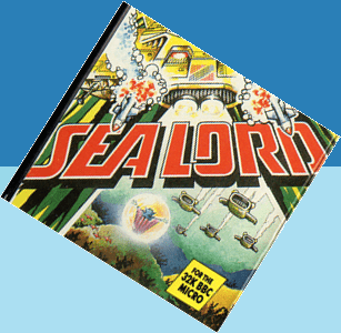
In Sea Lord I would say that the colours might have changed between the revisions and are planned or the printshops have used different colours – you judge. See below for yourself.


Collector Insights on the inside
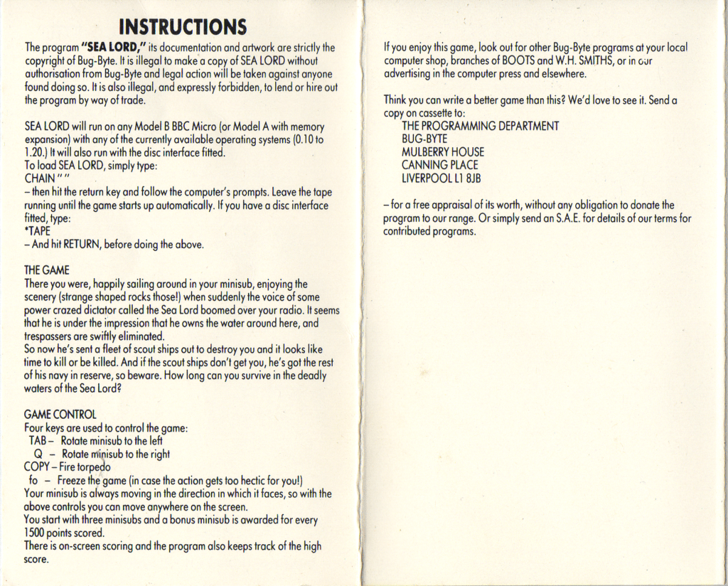
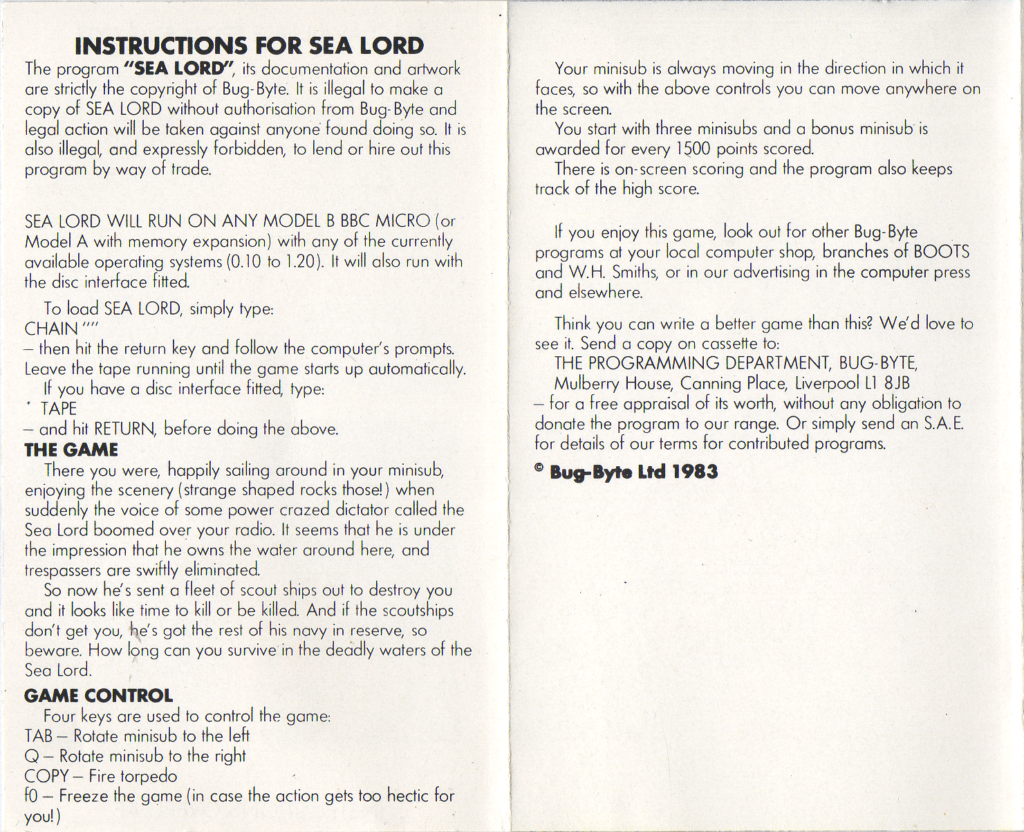
Last but not least, when these small changes are done what happens then with the inlay on the inside? Are these small changes also an opportunity to improve the texts and instructions? Check for yourself below.
